The Power Of A Good Logo is both Memorable and Appealing.
A Strong Logo: First Impressions
Let me start by saying that the power of a logo by itself cannot simply save a company and create an instant attraction to the mission. Effective Branding is a combination of things. Great client service, follow through, attitude, and an inexhaustible mission to make the clients experience truly exceptional, is the heart of a company and what makes the logo proud. Not the other way around. Branding Strategies that aim to resonate “feelings” and “messages” to a consumer is a complex myriad of many dynamics that all make up the hallmarks of a company and become the backbone of the logo. The heartbeat of any company is their logo. It pulsates trust and gives each consumer something to identity itself with when thinking and feeling about a particular experience or product.
When I think of gold and crispy French Fries and the salty yet firm taste of them, the Golden Arches instantly come to my mind. I think we’ve all been driving late at night on a highway and remember seeing the golden arches lit up from across the hills and we immediately can taste the food and remember a particular experience. Consistency and longevity have been at the forefront of McDonalds’ success. You get the same quality and taste 20 years later as you did when you were a kid. You have come to expect that. Their logo radiates this message each and every time. The experiences over time have led our minds to perceive a certain expectation from the Golden Arches.
Memorable & Appealing
Two important facets of a strong logo: It is both Memorable and Appealing. A well-designed logo takes into consideration the durability, functionality, and how “sticky” it is in the minds of the consumers. When we talk about “stickiness,” we reference how well it can bridge the gap between the product and service the company offers in relation to their brand identity. The company logo is at the forefront of this influence. A great logo can even elevate the positive reinforcement of a brand by associating its visual power directly to the service or products. A well thought out logo can influence a consumer’s thoughts so powerfully that they associate the mark or logo into a feeling they get from their experiences with dealing with the company. This “feeling” radiates from the visual stimulation of the logo design. An example of this is the NBC peacock logo. When we see the peacock, our memory dials up past shows that have resonated in our psyche and we correlate the peacock to quality entertainment that has influenced us in some small or large way.
Visual Power vs. Feeling / Experiences
A strong logo can evoke feelings in a consumer and create a loyal “attachment” to the brand. The experiences a consumer has can directly create a myriad of feelings that attach themselves to the brand logo. The shift between the visual correlation to the logo and the feelings / experiences one has for the brand go back and forth and create “loyalty” and “relationships.” A well-designed logo takes all this into consideration and the colors, symbols, and objects that make up the logo evoke the purpose and mission of the company. A business that’s using therapeutic methods to heal and calm stress could possibly have a soft blue as a dominant color in the logo. The experiences of being calm from the company’s services can directly be felt by the client and evoke feelings from the colors. An attachment happens between the consumer and logo. The logo identifies with the consumers subconscious an immediate experience to the services or products and reinforces this feeling even more by great use of colors and objects to create the perfect visual appeal to the brand.
The Power of a Logo through Colors & Fonts
Researching colors for a brand identity is a critical component of capturing the perfect feeling and mood. A Therapy practice could use a soft blue to represent calmness in their logo design. A Mexican restaurant would benefit from their countries colors to immediately identify their cuisine. To provoke hunger, yellow and orange can be a very powerful color choice in a logo.
Font choices create a nice contrast or cohesiveness to the essence of the brand. Cursive fonts create an elegant and light feel to the overall mood. A strong and thicker font can create a solid foundation that promotes strength and durability. Sometimes using both can actually create a nice contrast depending on the slogan or title of the business. Using contrasting elements in a logo is a powerful element.
A Strong Logo Should:
- Be memorable to the masses
- Resonate the business mission
- Identify its purpose through color
- Create a strong visual association to the products and services
- Stand out from the competition (unique and appealing)
- Have a broad printing and advertising range
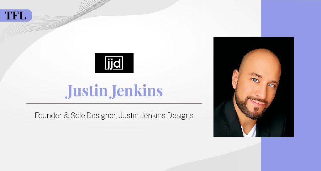
Author: Justin Jenkins | Founder & Sole Designer at Justin Jenkins Designs | justinjenkinsdesigns.net
- 📌 Visit Justin Jenkins 👉 – LinkedIn Profile
- 🌐 Explore Justin Jenkins Designs 👉 – Company Website


